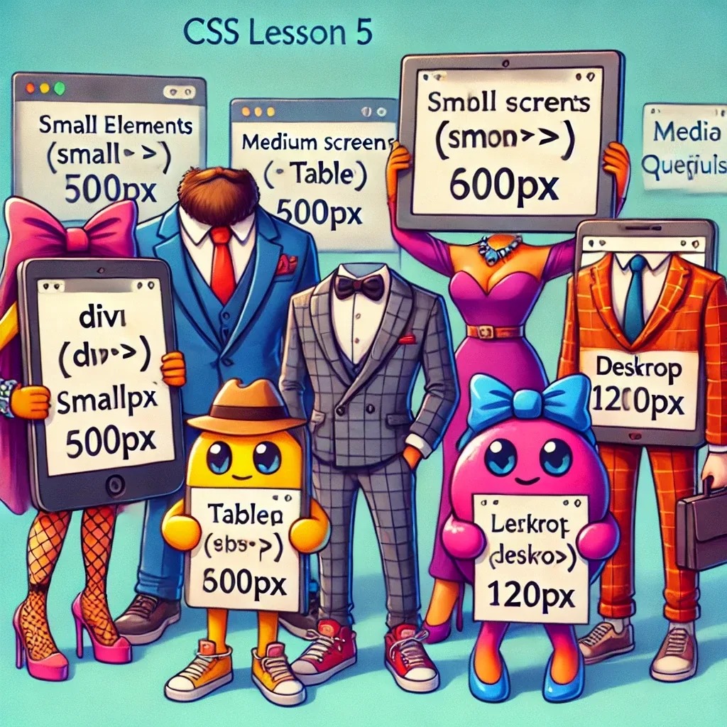
Lesson 5: Media Queries – Making Your Website Look Good on Every Screen!
Overview
Hello there, aspiring web designer! 🧐 If CSS Grid was like arranging guests at a formal dinner, then Media Queries are more like making sure each guest has the right size chair, no matter how much they’ve had to eat. Think of media queries as the fashion stylist for your website—adjusting everything from the size of your buttons to the layout of your text based on the device your visitors are using.
By the end of this lesson, you’ll be able to create responsive layouts that look as good on a tiny smartphone as they do on a widescreen TV. So, grab a cup of Earl Grey and let’s get started!
Step 1: What Are Media Queries?
Media queries are like a personal tailor for your CSS. They allow you to apply different styles depending on the size of the screen or the type of device. It’s like saying, “If the screen is this wide, use these styles. If it’s narrower, use these ones instead.”
Here’s a simple example:
@media (max-width: 600px) {
    body {
        background-color: lightblue; /* Make the background blue for small screens */
    }
}

@media (min-width: 601px) {
    body {
        background-color: white; /* Make it white for larger screens */
    }
}
In this example, if the screen width is 600px or less (think: smartphone), the background turns blue. If it’s 601px or more, it stays white. Simple, right?
Step 2: Set Up a Responsive Layout – Your Website’s Got Style!
Let’s create a small HTML file to see media queries in action. Create a new project folder:
cd ~/Documents/
mkdir my-responsive-website
cd my-responsive-website
touch index.html styles.css
Now, open index.html in your favorite editor (Vim, VSCode, or Nano—pick your weapon!):
HTML
<!DOCTYPE html>
<html lang="en">
<head>
<meta charset="UTF-8">
<meta name="viewport" content="width=device-width, initial-scale=1.0">
<title>Responsive Design with Media Queries</title>
<link rel="stylesheet" href="styles.css">
</head>
<body>
<header>
<h1>Welcome to My Responsive Website!</h1>
</header>
<main>
<p>This page will adjust its layout based on your screen size. Resize the browser to see the magic happen!</p>
</main>
<footer>
<p>© 2024 My Responsive Site</p>
</footer>
</body>
</html>
CSS
Open styles.css and add the following styles:
body {
    font-family: Arial, sans-serif;
    background-color: #f0f0f0;
    text-align: center;
}

header, footer {
    background-color: #3498db;
    color: white;
    padding: 20px;
}

main {
    margin: 20px;
    padding: 20px;
    background-color: white;
    border: 1px solid #ddd;
}

/* Media Queries - Making the Layout Responsive! */
@media (max-width: 600px) {
    header, footer {
        padding: 10px;
    }

    main {
        font-size: 14px;
    }
}

@media (min-width: 601px) {
    main {
        font-size: 18px;
    }

    header, footer {
        padding: 30px;
    }
}
Step 3: Hosting Locally with Caddy – Bringing Your Creation to Life
Let’s make this masterpiece live! Use Caddy to host your project locally. No complex configuration needed—just one simple command.
Open your terminal and navigate to your project folder:
cd ~/Documents/my-responsive-websiteStart your local server using the Caddy command:
caddy file-server --listen :8080Open your browser and go to:
http://localhost:8080
Your project is now live on your local server! 🎉 Time to show off your responsive design skills.
Important Tip: CSS Not Updating?
If you’ve made changes to your CSS but don’t see them on your page, the browser might be using a cached version. To fix this, perform a hard refresh:
- Windows/Linux:
CTRL + F5orCTRL + SHIFT + R - Mac:
CMD + SHIFT + R
This forces the browser to reload the page without using the cache, so you’ll see your latest changes.
Step 4: Test the Layout – Resize and Enjoy!
With your site hosted locally, open the page and start resizing your browser window. Watch your layout adjust and transform as you go from a small phone screen to a giant desktop display.
What happens:
- On screens 600px wide or less: The text and padding shrink to fit smaller screens. Everything’s compact and neat, like a perfectly packed British lunchbox.
- On larger screens: The text size increases, and the padding gets bigger—more space for everything to breathe, like a royal banquet!
Step 5: Go Further – Target More Devices!
Media queries aren’t just about screen size. You can target different devices, orientations, and even screen resolutions. It’s like being able to change outfits depending on whether you’re attending a garden party or a black-tie event. Here are a few more examples:
/* Target tablets in portrait mode */
@media (min-width: 600px) and (max-width: 768px) and (orientation: portrait) {
    body {
        background-color: #ffeb3b; /* Give tablets a yellow background */
    }
}

/* Target high-resolution screens */
@media only screen and (min-resolution: 192dpi) {
    main {
        border: 2px solid #000; /* Add a thick border on high-res displays */
    }
}
Experiment with different queries to see how they work. Want to change font styles on a smartwatch? Go for it! Want to hide content on devices with tiny screens? You got it! Media queries let you control the entire user experience, no matter the device.
Conclusion
Well done, style master! 🎩 You’ve learned how to use media queries to create responsive layouts that adapt to any screen size. Whether your visitors are on their phones, tablets, or giant desktop monitors, your website will look sharp and stylish.
In the next lesson, we’ll dive into transitions and animations—adding some flair to your design, like making buttons wiggle when hovered over or text slide in like a suave British gentleman. Until then, keep refining your responsive layouts, and remember: a well-dressed website is a happy website! 😎
See also
- Lesson 2 – Loops and Conditionals: Making Decisions and Repeating Yourself (Without Going Crazy)
- Unlock the Power of JavaScript – A Beginner’s Journey (No Cape Required)
- Lesson 2: Variables and Data Types – The Building Blocks of Your Java Adventure
- Lesson 1: Hello, Java! (And No, It’s Not Just Coffee)
- Ready to Master Java? (And No, We're Not Talking About Coffee Beans!)